DMA
DIRECT MARKETERS' ASSOCIATION EXPO
LAYOUT DESIGN, EVENT MARKETING, EVENT BRANDING
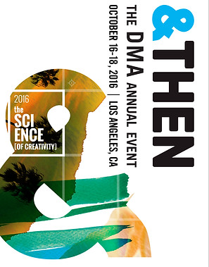
The Direct Marketers Association (DMA) host a conference called &Then, this particular year’s theme was “The Science of Creativity.” During my time with experience design agency FreemanXP I was tasked with developing three visual identities presented via a conceptual piece of direct mail marketing. How fitting!
CONCEPT 1:
WATERCOLOR
This concept, “Watercolor” was the prevailing option. This approach was initially conceived by Art Director E. Sean Hampton Gross. With a venue location in Los Angeles, the focus here was on showcasing the L.A. landscape and familiar images of sunshine and palm trees combined with a loose, painterly watercolor visual system. To incorporate the blend of science and creativity, we designed a wordmark to make a visual reference to the Periodic Table.


CONCEPT 2:
LA DREAMS
Here, I took a direction similar to “Watercolor,” this organic looseness with hard, restrictive edges. I was reminded of molecular models and their use of the hexagon shape. So, for this concept I leaned into the hexagon as a visual system.


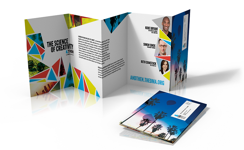
CONCEPT 3:
DIFFERENT ANGLE
This concept was essentially the triangular cousin of “Watercolor.” Retaining the sunny Los Angeles imagery, there is a departure from painterly ink washes into an exploration of random but organized trangles.